Note: This page is a review which forms part of the post Windows 10 System Apps Review
What’s this app for?
It’s used to create and share interactive reports, presentations,
personal stories and, most likely, even more things than I can imagine. Think
of it as like PowerPoint in Microsoft Office but with much more razzmatazz and
interactivity.
Does it do the job it
was primarily designed for?
I believe so but I have to admit I personally don’t get on
with Sway that well. The main reason I believe for this is because I don’t
really have a compelling reason to do anything with it and, although I’ve tried,
I just wonder why I’m bothering to spend time in an app when I could knock
something up in a much more basic way in Word or PowerPoint. However, I have
seen what people have produced in Sway and it’s pretty darn good. There’s a big
fan club for this app and its part of Windows 10 now so everyone should at
least have a look at it.
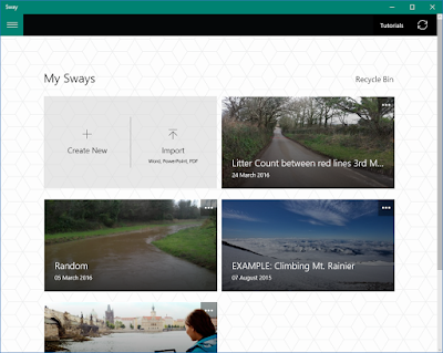
 What doesn’t go down that well with me is that the initial screen
is very universal app like. I.e. it’s bland. It opens up by default with
several example files (called Sways) that you can look. Plus there’s easy
access to import in almost any file in which to start creating a Sway with.
Lastly, the main screen allows you start with the barebones and create a blank
Sway.
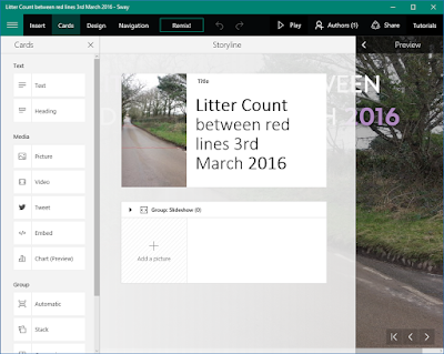
Once you’ve loaded a Sway to work on, there are 9 menu options along the top horizontal bar; the main hamburger menu, insert, cards, design, navigation, remix, Play, Authors, share and tutorials. Blimey, that is a lot, and most of those are just headings to further goodies. The app’s hamburger menu performs the basics of allowing you to open, duplicate or create new Sways. There is no “Settings” facility though in this app, which is a little surprising. ‘Insert’ takes the powers of inserting information into Sway to another level. You can get content from almost everywhere; OneDrive, Facebook, YouTube, Twitter, your camera, or just upload it, to name but a few of the sourcing opportunities. No Google there yet though. It’s the ‘Cards’ aspect of the app you’re likely to spend most of your time in as from here is where most of the content manipulation happens. With this menu item selected the left hand vertical panel gives you easy access to insert different “cards” (which is basically the name for any type of content you add) into your Sway. There really is a heck of a lot here and much too much for me to waffle on about. But almost any kind of content, and editing of that content to make it look jazzy and interactive, can be done here. Zooming in on photos, slideshows, tweets, charts – it’s all here and more. This is certainly where all the fun and creativity happens, although that seems to be something I’m missing when it comes to using this app.
Any downside to this app? Well, aside from the initial home
screen looking like it came straight from paintbrush, the main issue I have
with the app is understanding it, although if I could think of a purpose, then
a good few hours of concentrated time in the app and I’m sure all will be very
clear. However, if you have an app where most people are thinking like me,
which is “What do I do with this?” then this is perhaps not a good start when
people notice it in the start menu.
What’s the
alternative?
There’s more than one way of creating interactive
presentations these days. PowerPoint still does a decent job although it’s not
free. Even Google Photos has its own less comprehensive version of Sway. I dare
say the Store has some alternatives too.
Hit, Miss, or Maybe?
Maybe; Sway is
very comprehensive and a powerful app for creating interactive content for
presenting to friends, families or work colleagues. It’s got a lot going for
it. My only concern is that most desktop users won’t find a reason to utilise
it to its potential or, worse still, not even bother with it.

No comments:
Post a Comment