Monday, 28 March 2016

Star Wars Rebels S02E20 "The Mystery Of Chopper Base"

Synopsis

"Kanan, Ezra and Ahsoka prepare to depart to unravel Vader's secret, while the rebels find a way to fend off the predatory creatures that occupy the planet."

What I thought?

The calm before the storm ...

A run of the mill episode with a rather unimaginative main plot on top of the underlying preparations for Kanan and Ezra to go Inquisitor hunting. Things start off somewhat interestingly, with Kanan and Ezra lightsaber dueling, but when we get to the mystery of the planet and the discovery of large big head spiders lurking, it's really nothing new or engaging. The standard scary reveal, following by someone being captured, the rescue, the trap and then the figuring out how to escape - it's all pretty typical plot stuff. It's not awful, but it's also not really anything to get invested in. The spider creatures don't like the rebel transmitters, so it turns out, but only keep about a foot away from them. Sure they put tens of them around the base, but the critters still walk right past them, but don't enter the base at the end. You'd think one day they'd figure out just to grin and bear the transmitter for one second and, hey presto, they are in the base!

So, we get farewells at the end as the team head off to the planet that Yoda told Ezra to go. The one where we know Darth Maul lurks. Will Ezra really go bad or just flirt? I'd bet on the latter although love the former suggestion. We know we've got inquisitors and Darth Vader in the hour finale and I can't wait.

Rating 5/10 (OK)

Ezra is pretty nifty with a lightsabre these days.

How great it was to know that there is a creature Ezra can't use the force to communicate with!

So, they rescued Rex, but no one mentioned the other rebel who went missing!

The transmitter scare the creatures at least a yard or two away.

Certainly they are scary creatures, but lets face it, the rebels did attack them first!

Windows 10 System Apps Review: Conclusion

Note: This page forms part of the post Windows 10 System Apps Review

And so my review of all 29 system apps available in Windows 10 v1511 comes to an end. This means it’s time for some conclusions.

When one tots up the ratings I gave for each app we end up with:

HIT         13
MAYBE 12
MISS      4

This at first appears as if the vast majority of the apps performed excellently, although it’s worth remembering that “Do they do the job they were primarily designed for?” was the main criteria, which for a lot of the apps was fulfilled either because they couldn’t fail (e.g. ‘Get Skype’ app is just a link) or because, love them or loath them, they do actually do a basic job (e.g. People app).
Being a ‘Hit’ doesn’t mean they are the pinnacle of their genre, or that there isn’t room for some improvement, or lots of improvement. But when an app does do a decent job on its basic functionality, it’ll be all too easy to knock them down. I tried to come at the reviews from the angle where I imagined the vast majority of desktop users looking at each app to deliver on their own basic expectations in terms of functionality and usability.

Sure, most UWP apps look bland and lack sophistication but does that make them useless? As I found, most of the apps deliver something to the user, although whether anyone would actually notice the apps in the first place, or use them as a first choice to do a specific function … well, that’s another story altogether. Easily you can get better functionality and usability elsewhere for all but a few of the apps Microsoft offers for free. If you look at alternatives you can use on Windows 10 to any of the 29 system apps, it’s most likely only perhaps Alarms and Clocks, Calculator, Contact Support, OneNote, Store, Sway & Voice Recorder would be those you would be highly tempted to use in the first instance rather than going elsewhere. On the desktop the alternatives are vast and thus the system apps for most people are not the first choice. On Windows 10 mobile it’s most likely a totally different issue because there aren’t a lot of high quality alternatives.

From a Windows 10 desktop perspective the end conclusion is:
  • Could the offering of system apps be better? Hell yeah. They could be considerably better.
  • Are the offerings of system apps poor? No. There’s some usefulness in most apps and a decent ‘stab’ at basic functionality.
  • Could you do without most of the system apps? Yes. Easily. And therein lies the problem at this juncture for Microsoft and their crusade to promote UWP as a big deal


MY RATING
ARE THERE BETTER ALTERNATIVES?
3D Builder
MISS
MAYBE
Alarms and Clocks
HIT
NO
Calculator
HIT
NO
Calendar
MAYBE
YES
Camera
MAYBE
MAYBE
Contact Support
HIT
NO
Films & TV
MAYBE
YES
Get Skype
HIT
NA
Get Office
HIT
NA
Get Started
HIT
MAYBE
Groove Music
MAYBE
YES
Mail
MAYBE
YES
Maps
MAYBE
YES
Messaging
MISS
YES
Microsoft Solitaire Collection
HIT
MAYBE
Microsoft Wi-Fi
HIT
MAYBE
Money
HIT
MAYBE
News
MAYBE
YES
OneNote
HIT
NO
People
HIT
YES
Phone
MISS
NA
Phone Companion
HIT
YES
Photos
MAYBE
YES
Sport
MISS
YES
Store
HIT
NA
Sway
MAYBE
NO
Voice Recorder
MAYBE
NO
Weather
MAYBE
YES
Xbox
MAYBE
NA

Windows 10 System Apps Review: XBox


Note: This page is a review which forms part of the post Windows 10 System Apps Review

What’s this app for?

The Xbox app brings together your friends, games, and accomplishments across Xbox One and Windows 10 devices.” So says Microsoft. I had to get their quote because I wasn’t sure myself how to explain this app to anyone J

Does it do the job it was primarily designed for?
I know what you’re thinking. “I’ve not got an Xbox, so what use is this app to me?” Well, fear not, because Microsoft has made this app more than just about that games console taking up space in your front room. Game apps created by Microsoft in Windows 10, such as Minesweeper and the Solitaire Collection, integrate with the Xbox app for all the social aspects of competing with friends. And if that doesn’t grab your attention, then probably the rest of this review won’t either.


The home screen of this app is quite busy. You’ve the main menu down the left side which is expandable via the hamburger icon, with the rest of the screen taking up by a large “Activity Feed” panel with a “Friends” panel on the far right. If you use Facebook you’ll be mostly at home here in terms of the social mechanisms.  

In the Activity Feed you can post your gaming achievements to share with friends, as well as view a lot of posts by Xbox about games you’ll likely not play if you’ve no Xbox. Sigh. Plus I can’t find a way to not see Xbox posts sadly. Never mind. Anyhow, over in the friends panel you get access to see which friends are online, find friends, create a games party (yes, to play games together), view messages between friends, and see all comments friends have made about what you’ve posted. Absolutely everything you could think of for interacting with your friends is most definitely there. You can even connect the app to Facebook should you so wish.


Off the main hamburger menu are 10 options; your avatar profile (of which you have to create one when you first open this app), home screen (where you start off), My Games, Achievements, Game DVR, Trending, Store, OneGuide, Connect & settings. Avatar wise the options are numerous but, where there is no choice, is in terms of photo. You have to choose an image for your photo from a decent choice but you can’t put your own mugshot there. Well, this is an avatar I guess. In this section you can also view the games you’re playing, your achievements in those games, who your friends are and some other basic customisation options for your avatar. It’s certainly quick and easy to set up an avatar.


Next down the main menu is ‘My Games’ which for me consists of just “Microsoft Solitaire Collection” but undoubtedly they’d be many more for serious game fans. The games don’t have to be Xbox ones or apps but can be more traditional PC games in much the same way ‘Steam’ supplies you games from the cloud. ‘Achievements’ shows you how well you’ve done in your games, with numerous quests to complete to get more XP (think street-cred). ‘Game DVR’ is where you can see game clips from any game that interacts with this Xbox app. Sadly, though, not all Windows 10 PCs support this feature, and my laptop is one that can’t do this, thus it’s useless to me. ‘Trending’ is an at-a-glance look at what games everyone likes which you can play via this app. ‘Store’ is a front-window into the actual Store app to download/purchase Xbox app supported games. ‘OneGuide’ relies on you having an Xbox connected in order to view TV Listings. Thus I have nothing further to say here. ‘Connect’ likewise needs an Xbox. Lastly we’ve ‘Settings’ of which there’s quite a few options within. As well as signing in and out of your account, you can setup a link to your Facebook account, turn the live tile on/off, change various notifications that the app can alert you to (such as when a friend sends you a message) turn off friends posting in your activity feed (argh, but I want to turn off Xbox posts!) and lastly, an option to show game streaming on the app’s home page (another feature useless without an Xbox). There are even more options via the mini settings menu which are very much more tailored towards those with an Xbox.

Bizarrely there’s no setting to change between the light and dark theme in this app. You’re stuck with blackness, which works ok but is a little depressing perhaps. There’s not a lot I can say that I dislike as even though maybe half or more of the app is useless without an Xbox, the social features and achievements are still just as relevant if you just play Windows 10 game apps or classic PC games that integrate with this Xbox app. It is a bit annoying that you have to create an avatar to use the app but at least it’s a quick process.

What’s the alternative?

For social features when using Microsoft Xbox integrated games, there’s no alternative. This is what the Xbox app is for. Most, like me, might be used to using ‘Steam’ for their PC games although I much prefer the social aspects of the Xbox app than those in Steam, where it’s very cluttered and confusing to really interact with people.

Hit, Miss, or Maybe?

Maybe; even though without an Xbox console this app is largely redundant, if you are a bit of a games player via Xbox apps on Windows 10, you’ll probably find the social and achievements aspects of this app useful and fun. If you’re not interested in games at all, or play your games solely via the likes of Facebook, this app is of no value at all.

Windows 10 System Apps Review: Weather


Note: This page is a review which forms part of the post Windows 10 System Apps Review

What’s this app for?

This is your one-stop shop for finding out the current weather conditions and forecast in your part of the world, as well as anywhere else on the planet that you’ve got a particular interest in.

Does it do the job it was primarily designed for?

Umm. Well, the fact that I don’t use this app at all when it comes to weather forecasts should say it all. There’s some lovely aspects to this app such as fantastic live tile support, beautifully animated and relevant background graphics behind the forecast, and great quick-access/snapshot of favourite locations. Sadly none of these are enough for me to bother with it on a daily basis, except that the live tile looks cool in my start menu. There’s no doubt though that the wealth and variety of content is very good in this app. It’s just that it’s delivery of that information isn’t up to the same standard.


As you can see above, the default view (with the hamburger menu expanded) tells you right away what’s going on in your chosen location, as well as what’s coming up in the proceeding days and hours. It’s a great one-stop visual guide to what’s going on. I’m not sure I have a lot of confidence in the accuracy but it’s usually good enough in this aspect. After all, these are forecasts, not guaranteed predictions. The initial amination you get when you first land on the home screen is pretty cool, although on a rainy day I’m not sure I really want such a visual reminder. If anyone out there gets fed up with all the usual waffling in forecasts, they’ll love the ‘Day Details’ which you can view as you keep scrolling down the home screen. Everything is explained in a few short sharp sentences. Certainly this won’t leave you guessing, although I’m the kind of person who would rather have an essay than a headline. Even further down the screen is yet more useful information such as sunrise/sunset times, moonrise/moonset times, moon phase, precipitation/humidity/UV index and Max Wind values for the current day. Lastly there’s precipitation and temperature stats for this day in terms of historical records. Certainly there’s a wealth of useful and less useful (yet interesting) information here, but scrolling down for it all is pretty tedious on a desktop PC. Plus, there’s a section all for historical data in the app, so why put this information here? Oh well.


The next section available in this app to you from the main hamburger menu is ‘maps’. Here you can see temperature, precipitation, satellite and cloud cover for your neck of the world, as well as the ability to scroll chronologically through the next 24-ish hours to see how these four features change over time. It’s nothing revolutionary but useful. There’s a zoom button on the map but for some reason it doesn’t zoom in all that well. Some of the maps (the temperature one especially) looks particularly blurry. Still, this is a decent stab at this facility, although it certainly could do with something that makes it look a lot more polished.

Next up off the hamburger menu is ‘historical weather’ which strangely is just a list of months in your chosen location, along with temperature and rainfall records. It’s interesting, but there’s hardly enough information here to warrant its own section in the menu.

‘Places’ is the next option from the main menu, and probably the one part of the app I actually load it up to look at on any regular basis. Here you can add favourite places from all around the world and get a snapshot view of their current weather conditions all on the same screen as your other favourite places. I really love this. It’s simple, useful and pretty. Clicking on any of the places will change the app so that the Home, Maps and historical data sections are now reflecting that location. It’s a quick way to check out the weather in locations you have an interest in. You don’t have to set favourite locations just to check out weather around the world as there is a search box up the top right of the app that’s always present. This allows you to search for a location, select it from a list and have the app display that location’s weather whenever you feel like it.


The final option from the menu is for ‘news’. As you’d expect this is the section that provides you with all the latest weather news that’s been pulled from relevant news sources from your part of the world. Unlike the sports app, all the articles I’ve clicked on here do open in the app’s reading view. Thus providing a consistent and neater way to read. There’s a few slideshows and video articles in amongst actual textual content but hardly a sniff of any advertisements anywhere in this app. The only downer in this section is that the actual content is months old. I’m assuming this is a bug in the current version of the app. There’s no manual refresh page button either sadly. I don’t remember noticing old content before, so perhaps just a bug at this current time.


Settings wise … there are some! Woohoo. Don’t get too excited though. As well as choosing the units of temperature for the app to display in, you can change the default launch location for the app, which is highly useful as there are limitations to Windows 10 detecting your location automatically. So being able to tell it where you are is critical and very much appreciated.

What’s the alternative?

There’s no other weather information built into Windows 10, but of course there are a wealth of apps in the store from 3rd parties such as The Weather Channel or Accuweather to choose from. Alternatively, and what I often do, there are numerous reputable websites to find weather information, such as The Met Office here in the UK.

Hit, Miss, or Maybe?

Maybe; the variety and amount of information available in this app is very good. There is a gorgeous live tile and some lovely features but there’s something a little unfinished about the app in some areas when it comes to its Maps and Historical Data sections. What also doesn’t help it is all the scrolling on the main screen, which gives the impression they really didn’t think about desktop users. Plus there’s the rather basic manner in which it delivers its forecast. On a desktop PC most users will not bother with this app and instead go straight to their favourite weather related website which will deliver a more well-rounded experience.

Saturday, 26 March 2016

Windows 10 System Apps Review: Voice Recorder


Note: This page is a review which forms part of the post Windows 10 System Apps Review

What’s this app for?

Doing exactly what its name suggests, this app records your voice via the mic in your computer, allowing you to record your memoirs (perhaps) and then play them back later.

Does it do the job it was primarily designed for?

Absolutely, but there’s no bells and whistles here. Although one might argue if it needs to be sophisticated to do a basic job?


Leading the charge for universal apps to look bland, this app succeeds with its default appearance of a grey background everywhere, except for the blue mic button in the middle. Unlike other apps, such as sway, there’s no guessing here where you need to click to use the app, is there?


As soon as you click on the big blue button the recording starts, possibly catching everyone out. You’re then presented with a slightly different screen, with the blue button now displaying the ‘stop’ square in the middle, a smaller pause button below, and another button to add markers to the recording. This latter option is actually quite interesting and possibly more useful than it might at first appear because once you’ve finished making a recording and open the file up again in the app (see above), these markers show up on screen, so you know exactly where in the recording you wanted your attention to be alerted to. You can easily skip to the markers, delete them or create more. It’s a shame you can’t label the markers though. Additionally, when you open up a recording in the app, you can share it, trim it, delete it or give it a more useful name than the default “Recording <number>” that the app gives it. There’s also the ability to open up the file’s location in file explorer, which just so happens to be in your documents folder.


In case you’ve missed it, there is a hamburger menu to this app, but it’s down the very bottom right. The two options it provides (when you aren’t playing a recording back) are Settings and Feedback, and both offer very little. In fact, there are no settings if you click that option as it just shows you information about the app, such as version and copyright info. This is quite possibly the most strangely labelled menu name in Windows 10 System app history. Sure, there is the option down the button to go to “Microphone settings” but it takes you to the mic permissions part of the settings app for some reason and not to any actual mic settings which still reside in Control Panel. ‘Feedback’ naturally takes you to the right place in the feedback app to complain or upvote any Voice Recorder related items.


What’s the alternative?

The original win32 version is history sadly and not in Windows 10. There are other apps in the store that offer up voice recording abilities though, and probably provide more features than Sound Recorder does.

Hit, Miss, or Maybe?

Maybe; I’ve used this app a few times for actual basic voice notes. It does the job nicely, so I believe it has a purpose although it really only does the basics. Does it need to do much more? I feel it’s slightly undercooked this app and should probably give us a little more customisation and features; something we had more of in its predecessor, the win32 version, called Sound Recorder.

Thursday, 24 March 2016

Windows 10 System Apps Review: Sway


Note: This page is a review which forms part of the post Windows 10 System Apps Review

What’s this app for?

It’s used to create and share interactive reports, presentations, personal stories and, most likely, even more things than I can imagine. Think of it as like PowerPoint in Microsoft Office but with much more razzmatazz and interactivity.

Does it do the job it was primarily designed for?

I believe so but I have to admit I personally don’t get on with Sway that well. The main reason I believe for this is because I don’t really have a compelling reason to do anything with it and, although I’ve tried, I just wonder why I’m bothering to spend time in an app when I could knock something up in a much more basic way in Word or PowerPoint. However, I have seen what people have produced in Sway and it’s pretty darn good. There’s a big fan club for this app and its part of Windows 10 now so everyone should at least have a look at it.

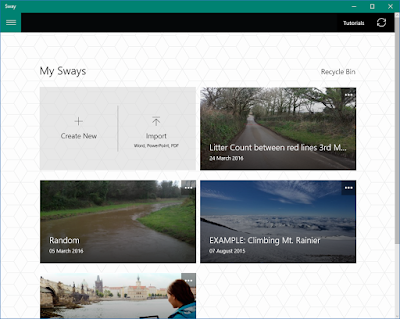
What doesn’t go down that well with me is that the initial screen is very universal app like. I.e. it’s bland. It opens up by default with several example files (called Sways) that you can look. Plus there’s easy access to import in almost any file in which to start creating a Sway with. Lastly, the main screen allows you start with the barebones and create a blank Sway.


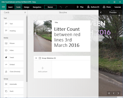
Once you’ve loaded a Sway to work on, there are 9 menu options along the top horizontal bar; the main hamburger menu, insert, cards, design, navigation, remix, Play, Authors, share and tutorials. Blimey, that is a lot, and most of those are just headings to further goodies. The app’s hamburger menu performs the basics of allowing you to open, duplicate or create new Sways. There is no “Settings” facility though in this app, which is a little surprising. ‘Insert’ takes the powers of inserting information into Sway to another level. You can get content from almost everywhere; OneDrive, Facebook, YouTube, Twitter, your camera, or just upload it, to name but a few of the sourcing opportunities. No Google there yet though. It’s the ‘Cards’ aspect of the app you’re likely to spend most of your time in as from here is where most of the content manipulation happens. With this menu item selected the left hand vertical panel gives you easy access to insert different “cards” (which is basically the name for any type of content you add) into your Sway. There really is a heck of a lot here and much too much for me to waffle on about. But almost any kind of content, and editing of that content to make it look jazzy and interactive, can be done here. Zooming in on photos, slideshows, tweets, charts – it’s all here and more. This is certainly where all the fun and creativity happens, although that seems to be something I’m missing when it comes to using this app.


Other fancy things you can do is similar to in PowerPoint, in that you can apply styles to the whole Sway, which changes the font and textures to make things look radically different and possibly appealing. You can also change if your Sway navigates vertically or horizontally, preview your sway, share it with other people or view tutorials on what the heck you can do with this app. There really are a lot of options within this app. This certainly impresses me. An added bonus to this app though is that it has an online version here https://sway.com/, and also collaboration abilities. On top of that you can also show anyone your sway no matter what OS they are on, simply by sharing the sway’s url.

Any downside to this app? Well, aside from the initial home screen looking like it came straight from paintbrush, the main issue I have with the app is understanding it, although if I could think of a purpose, then a good few hours of concentrated time in the app and I’m sure all will be very clear. However, if you have an app where most people are thinking like me, which is “What do I do with this?” then this is perhaps not a good start when people notice it in the start menu.

What’s the alternative?

There’s more than one way of creating interactive presentations these days. PowerPoint still does a decent job although it’s not free. Even Google Photos has its own less comprehensive version of Sway. I dare say the Store has some alternatives too.

Hit, Miss, or Maybe?

Maybe; Sway is very comprehensive and a powerful app for creating interactive content for presenting to friends, families or work colleagues. It’s got a lot going for it. My only concern is that most desktop users won’t find a reason to utilise it to its potential or, worse still, not even bother with it.

Windows 10 System Apps Review: Store


Note: This page is a review which forms part of the post Windows 10 System Apps Review

What’s this app for?

The Store is a one-stop shop for purchasing music, videos, games and apps for your Windows 10 devices. It’s also the hub where updates for apps, especially all windows system apps, are controlled and downloaded from.

Does it do the job it was primarily designed for?


Yes, although it’s far from perfect. The biggest issue with the store is the one that everyone knows about but has only slightly improved in the last year; the lack of apps. There’s certainly plenty of everything in the store, but the absence of big names which are everywhere on other platforms (think Google for starters) are just not there in the store. On top of that, what there is seems to be of a largely inferior quality or just never get updated and instead remain with the Windows 8 app look that’s straight out of 1990s in Windows 10. All these issues are well known, with Microsoft looking to inspire developers in an effort to move things along quicker. But what about the store app itself and how it performs?

Well, the store certainly looks busy and, much like every universal app, it’s a little clunky and blocky in its design but functions perfectly adequately for what one needs it to do.

Along the top, and available wherever you are in the app, are the main headings of ‘Home, Apps, Games, Music & Film & TV’ as well as buttons to drop-down the app’s main menu and search box facility. Every one of the genre sections opens up to reveal the same layout of new, top-selling and featured content. When viewing any specific content the usual options are there to share it (a link to it, not the actual content), buy/install, screenshots of the app/music etc, customer reviews and additional information about the content (for games/apps) such as age ratings etc. If viewing music or TV/film content in the app you can view a trailer for video content or listen to clips of the specific music tracks.

The app’s main drop-down menu gives you 'My Library' where you can view your library of apps that you’ve installed (not music/films as that’s solely in their respective universal apps), view downloads/updates, view settings, redeem a code (from a gift voucher etc), View Account, Payment options and Purchased. The latter four options all will launch your default web browser to perform the Microsoft account functions, so there’s little full integration in the app when it comes to your Microsoft account. Settings wise you can have apps not update automatically (default is auto and one I turn off), have the store’s live tile basically advertise various products in the store for you, or set things so that you don’t need to enter your password to purchase content, which just feels like a really bad idea.


The experience of downloading apps is pretty acceptable. Even downloading music I’ve found to just work. Still not done any video content yet but there’s been very few problems with actually getting what you want from the store ... in my own experience.

On the downside for this app, there’s still an ongoing issue with changelogs (or “What’s New?”) information not being updated along with every release of a Windows System App. Other 3rd party app manufacturers seem to do a much better job at this than Microsoft, although the Windows Team has improved considerably in the last 6 months with this. It’s also not a problem of the app as such anyways.

What is an app issue is that, despite improvements, the search facility is still a little hit and miss when it comes to finding items you know exist, or those you’re curious to know if they exist.

Then there’s the annoying fact that in “My Library” you can’t delete apps that you’ve long ago uninstalled. Thus the list in your library just grows and grows with apps you’ve not the slightest bit of interest in anymore.

What’s the alternative?

If you are using Windows 10 there isn’t an alternative to getting universal apps on your computer. Plus, both the Films & TV app plus Groove integrate with the store to view and purchase items. Even the web based Windows Store (i.e. http://www.microsoftstore.com/store/msuk/en_GB/home for the UK one) will redirect you to the store app when it comes to purchasing, but at least it’s an alternative for navigating about the store.

Hit, Miss, or Maybe?

Hit; it’s far from perfect when you compare it to its rivals on other operating systems like Google Play Store, but as a mechanism for purchasing items and getting them updated, it does the trick. As it’s such a critical app for any Windows 10 user, one can’t really do without it. So given it serves its purpose it’s got to get a thumbs up but maybe with a caveat that “It could be much better”.

Wednesday, 23 March 2016

Windows 10 System Apps Review: Sport


Note: This page is a review which forms part of the post Windows 10 System Apps Review

What’s this app for?

For all the latest news from the world of sport, this app gives you access to sports articles from a variety of news sources and allows you customise the app to choose your favourite teams/sports.

Does it do the job it was primarily designed for?

Hmm. Essentially this app is the sports version brother of the News and Money apps as they are all news aggregators. Therefore you get access to a whole mass of sports stories from your region, which for the UK is the likes of the Daily Mail, Mirror, Guardian, as well as more global sites like goal.com and The Press Association to name just a few. There’s undoubtedly a lot of content in this app and some customisation but does that make it any good?


The menu options down the left vertical pane provide access to a mixture of default sports for your region and your favourites. Football, Tennis, Golf and Rugby seem to be there no matter what you’ve selected as your interests, with the main default being ‘Today’ which gives you a stream of all the latest sports news, although not just from your favourites. Pretty much every selection gives you the same look by providing a breakdown of articles from that chosen sport. The only option that is mildly different is ‘Today’ which gives you three options of ‘News’, ‘Match Centre’ and ‘Slideshows’. As you’d expect, the former is all the most recent sports news. ‘Match Centre’ gives you a list of fixtures, but strangely they are not related to your favourite sports. Despite having Formula One and MotoGP in my favourites, I’d expect to see the latest races in this list too, but alas no. The last option under ‘Today’ is the tablet friendly ‘slideshow’, which gives a list of all articles that are more for browsing photos than textual content.


Away from all the various sport sections of articles, the only other significant feature in this app is the ability to customise it to show your favourite sports and teams. Well, the ability is there although it doesn’t always feel like you are really in control in this app. Sure you can click on this section and then get quick access to your favourites but the oddity is that these customisations don't really impact the content of the app that much. This makes it almost feel like it’s not worth putting any customisation in as you still get sports you’re not interested in within the ‘Today’ section and the main menu doesn’t reflect your customisations. What’s the point here?


This app feels like the developers have made an attempt and then got bored when it came to tidying everything up. Some articles open up in the app's news template (which is a bit like reading mode in Microsoft Edge) which is nice and neat, but then plenty of articles open up in their respected website which is then embedded into the app. It’s a right mess to look at anything being force embedded into something else. This is supposed to be an app, not a glorified web browser. On top of all that there’s the usual adverts in places, just like in the money and news apps, but unlike those two, there’s only one option under ‘Settings’ which is to change the edition of the app to a region of your choice.

What’s the alternative?

Sports wise there are plenty of apps in the Store you can use, as well as news apps that will be much more appealing and tidier for sport than Microsoft’s offering here. Alternatively, even the news on a sport website is better than this misfiring app.

Hit, Miss, or Maybe?

Miss; if it provided proper customisation and had better formatting for reading all articles, this app might have something on the way to being half-decent. Instead it’s just a mess with weak customisation and lacking any reason to exist as an app when sports news websites provide better service than this does.