Sunday, 28 February 2016

Occupied S01E07

Synopsis

"Jesper Berg has won the election, but the Russians show no signs leaving Norway. Meanwhile, Hans Martin receives an intriguing offer from the Russians."

What I thought?

What an episode! So much happening this week both political and action wise.

We're thankfully spared the rigmarole of the referendum being played out any longer than necessary, as things start off with the PM not only scoring a victory with that vote, but also scoring with his PA. She's lurking sexily around his bedroom, confirming what I'd suspected for a long time. Those two are getting it on.

At the Norway-Russia border things are hotting up, which given it's ruddy cold out there, is saying something. Somehow the PM manages to get some EU assistance, but it's aircraft to patrol the area minus any actual ammunition. Hmm. In fact, a senior Russian Governmental figure calls the PM with a rather cryptic speech that sounds like a threat made by a James Bond Villain. Its disturbing stuff and the PM is obviously very flustered with a situation that is spiralling out of control, of which he has about as much control as a cog in a machine does. You can tell how stressed he is, as later on he's having a good go at his sex machine PA by complaining about her shoes.

Our main man, Hans, is this week on leave after being placed under an internal investigation what with that Birkeland shooting last week. Seems somehow Arnesen probably manipulated it to make it look like he was more at fault than her. Certainly she's created a good story to cover her "Free Norway" involvement. Rejecting several offers from the Russians to work for them, Hans is cleared by the investigation but is told he can no longer work for the Police department as he's lost his security clearance. That's rather clumsy huh? Anyhow, we all know where this is leading, even if it takes until the last few minutes for the PM and his intelligence chief to personally ask Hans in the comfort of his own house to accept the Russian's offer and become a sort of double agent. Even though she was in another room and shouldn't have been listening, we have Han's wife call him out to make sure he gets them to sign an agreement in writing yo show that he's on Norway's side and not the Russians if he does this.

Thomas's marriage is going south, but he's going East. Using some of his contacts he heads to the Norway-Russian border where a local reindeer hunter reports russian involvement in the area. Thomas not only misses his step-daughter's birthday (Although he sends a video msg) he also seems to have completely missed his wife's affair with the russian security guy. Thomas and wife are at clear odds this week, particularly over their son, who is now involved in a toss of war with his actual mum. There's no news on exactly what happened with him carrying a petrol bomb last week! That seems to have been fully resolved and glossed over. Regardless, Thomas gets a lift into russian territory, although come the end, we see his body being dragged out of a lake. Is he dead? I think we're meant to think so although I'm going to guess he's not. However, would stir things up if he was, huh? Seems this show does do cliffhangers after all!

Meanwhile, Arnesen goes fishing. Well, she meets that General whom we saw earlier in the season who has now retired and recruits him to recruit people who know how to fight to join "Free Norway". He's interested and thus with Iljas's help, Erikkson is sprung from prison as his court case is about to begin in rather dramatic fashion. His transport car is rammed, two police killed rather callously, before we see him with what must be Team Free Norway in the middle of nowhere where the General lurks along with Iljas and plenty of ex-military.

It's an episode full of developments which really shows the strain and pressure on the PM who is seriously not only being screwed by the EU and the Russians, but in some light relief, by his PA.

Rating 7/10 (GOOD STUFF)

And where does she keep her purse? Naughty Naughty PA.
Arnesen meets the now ex-military General to go fishing. 
Literally, he's fishing.
He briefly smiled, but naturally all returned to normal on the news that he was out of a job.
Thomas heads to the border but I doubt he'll want to see many reindeer, unless they are russian reindeer perhaps.
It's got to be said, but the EU Chief comes across as a major twat in this programme.
Aside from the serious issues going on, the PM feels the need to resolve something that he'll undoubtedly put his foot in at some point once again.
Dramatically sprung from jail, Erikkson joins up with a rapidly expanding Free Norway Group.
... you could say that! It's time for Hans to go somewhat as a double agent.
Is Thomas alive? Seems this show can do proper cliffhangers!


Windows 10 System Apps Review: Messaging


Note: This page is a review which forms part of the post Windows 10 System Apps Review

What’s this app for?

It’s messaging Jim, but not as we know it. Introduced with Version 1511 of Windows 10 and the promise of a revolution in messaging, this is the app that Microsoft provides to do skype and SMS messaging, as well as skype video calls.

Does it do the job it was primarily designed for?

No. My disdain for this app started from about a nanosecond after I first loaded it up in an Insider Build months before it got released to the general public. It not only looked a mess then, but has changed so very little since, that I’ve tried hard to forget it exists. Rivalling 3D Builder as one of the most pointless and unappealing apps in Windows 10, at least the former app works and is sophisticated enough to perform a job. The messaging app looks like it was created by a five year old. This is an app that only its mother could love.

When you’re actually using the app to communicate with contacts, it actually looks like a semi-appealing layout.

You’ve quick access to your contacts down the left panel, and a nice big panel to see all the messages and write within.

But, as you can see to the left,  it looks like some builders have come in and left before they’ve finished.

Highlighting that all is not right, you’ll often find that some emoticons you’ve sent via “proper” skype using the actually bonafide skype software doesn’t show up in the messaging app.


Outside of the view above, all gets even messier.

On the plus side, the search function (see right) for this app does actually work and takes you right to the heart of the conversation you was looking for.

Even making video calls will work, but this is just covering over the gloss, of which there’s literally no gloss to this app. whereas the actual skype software is rich in features and looks appealing, the messaging app is the complete opposite. Microsoft wants this app to replace skype in Windows 10, which is a bold and visionary statement, but seems somewhat daft to make when you put out an app that’s like asking Microsoft Word users to make do with Notepad from henceforth. It’s laughable.


The main problem is that this app looks basic, is basic and behaves like something basic. Only those who’ve never used skype before might be somewhat content with the app, because the amount of things missing in this app is a list longer than even Santa Claus has even seen.

What’s worse about Microsoft’s vision of an integrated all in one solution for SMS and skype in Windows 10, is that Messaging isn’t even one app, but three! The settings for the app are actually found in the video app, messages are in the messaging app and contact information relies on the People app. It’s all just plain weird.

The settings available to the user are themselves as bare as the app.

There’s a link to your profile (i.e. your Microsoft account via your browser), the ability to add friends to your skype contact list (which isn’t actually in skype, but the people app), turn on notifications in the action centre for messages or video calls, and finally the option to open up yourself to the gateway of hell itself by making the messaging app your default skype experience on Windows 10.

Here’s a tip; don’t do it.


What’s the alternative?

Using a pigeon seems like a better alternative than this app for conveying messages across the world. Of course, the real and best alternative is to install the actual skype software and quietly forget all about the messaging app on your PC. Alternatively, there’s always skype for web if you’re against having two skype services on the one computer.

Hit, Miss, or Maybe?


Miss. Maybe on Windows 10 Mobile this app might be seen as a reasonable alternative to a separate SMS/skype app but for the majority of us trying to live an honest and productive life on our PCs, it’s best that we all just move along right now and wait for this app to undergo serious re-constructive surgery over the coming years.

Saturday, 27 February 2016

Windows 10 System Apps Review: Maps


Note: This page is a review which forms part of the post Windows 10 System Apps Review

What’s this app for?

Guess. Ok, you got it right first time. This is an app for viewing maps. No, not Google Maps, but Microsoft’s HERE maps (previously belonging to Nokia). You can find out about locations, street views, traffic and even get directions to places around the world.

Does it do the job it was primarily designed for?

Yes, to a decent degree. The trouble is that most people are used to Google Maps. Anyone who has used Google will immediately feel somewhat resistant to this app and its map appearances as compared to the map market leader Microsoft’s offering is lagging, sometimes literally lagging. It’s not always that bad but it certainly doesn’t feel a fluid as it could be.


The basic controls on the screen at all times allow you to change orientation from a directional point of view and a 3D perspective, which both work very well. You can centre in on your location (which isn’t accurate on my laptop due to a “known issue” with Maps that affect some computers, but you can set a favourite/home location manually) and you can swap between aerial/map formats and turn on traffic/streetview markers on the maps as well as the obligatory zoom in/out controls. For me personally, these controls on a laptop feel slightly more useful than I’ve experience in Google Earth/Maps.

There’s also a wealth of extra information available in the app as opposed to your basic map manuverening, with direction to/from places, a very handy informative panel on places you’ve searched for, streetviews and even some 3D cities:


The 3D views are pretty and undoubtedly handy, but they are not fully polished and rather limited to a select few places. Zooming around can produce some rather convoluted and untidy views.


Settings wise there’s not a lot. You can change the units of measurement, your preferred directions (i.e. walking, trains), download maps (very useful I’d think), set a saved location (very handy if, like me, your laptop tells maps you are 500 miles away from where you actually are) and get access to some privacy related controls.


There’s a lot to the Maps App; some very useful and pretty features which work very intuitively. The downer is that everyone will compare it to Google Maps. It lags at times and has less street view locations than Google Maps. In terms of actually using it in a practical basis to get somewhere, rather than as a glorified atlas, I cannot say how good or bad the app is. Numerous experience online listening to people discuss HERE maps is that they don’t compare to Google Maps. However, using it on my laptop I’ve not experienced anything seriously wrong, but given the choice, I would use Google. But, if I was without any other map service, I think the Maps App would provide a reasonable duty.

What’s the alternative?

Well, we all know about Google Maps which will be the main rival everyone jumps to as soon as HERE or its Maps App frustrates. There’s no Google Maps App of course, but you can get to it via the web. There are also a shed load of Map related apps in the Store.

Hit, Miss, or Maybe?

Maybe; there’s a lot of useful features in this app, although whether I could rely on it if I was out in the wild … I’m not fully convinced.

The Curse of Oak Island S03E13

Synopsis

"In the season 3 finale, the Lagina brothers finally get results from borehole 10-X, while The Money Pit also yields an exciting discovery"

What I thought?

It's the end of a long season, and in the words of another TV show, Winter is coming. This programme wraps up a year's worth of digging, wandering, surmising, listening to random people with wacky theories, questionable logic and having some descendants of explorers get personal tours of the island. This is it, for what one guesses is 2015, meaning it'll probably be October 2016 before the next series hits the airwaves. If they've struck gold by then we'd probably know about it from the internet before the TV programme tells us.

So, this week we FINALLY get to see what's at the bottom of 10X. It appears to be "nothing much". There's no two wooden posts as seen in previous radar surveys, but instead one metal drill bar. There's no dead body but instead a depression with sink holes beneath it. There's not even a treasure chest, but a massive stone where the radar said the box was. The overall conclusion of the diver, who did a amazing job, is that it's a natural cavity. Rick's not 100% convinced that 10X is done and dusted, with the decision to spend millions on excavating and draining the hole to be taken, one guesses, off-air. How much do these brothers have in money? Probably more money then Oak Island will provide them in terms of monetary rewards one suspects.

There's a special tour of the island again for three sisters who are descendants of one of the first people on the island. I believe they are related to one of the original people who went over to the island and first discovered the symbols in the Oak tree. Speaking of trees, it's long gone of course, as Rick points out to one of the sisters. I'm left wondering if anyone has ever looked for its roots? Given the devastation done in that area in the 70s, I suspect the roots are probably compost on someone's garden by now. Anyhow, the ladies bring a gift. It's a small cross. Definitely metal. Stories in the family claim that this came from a treasure chest that was found beneath the Oak Tree 200 odd years ago. This is news to everyone in the War Room. There's little information on how much the cross has been tested by experts. "It could be 500 years old" is one of the claims the lead sister says, although there is of course no professional analysis provided.

Back at the money pit and a camera is being sent down that hole from last week where they found the smallest of smallest pieces of metal. Some 130ft down in a cavity they see something shinning like metal. Salivating at the mouth, it looks like this area will get some serious attention after the winter.

So, little is learn't this week. We've a potential dead end at 10X although with all the silt and distorted view down there I agree it's too soon to put a cross through 10X. Speaking of crosses, they really need to get that item analysed that the ladies brought before going too much further. Then there's the money pit area and this new hole. It's certainly worth a closer look. 

I just hope that they not only actually find something tangible in 2016 but also that maybe they hire some experts to work with them because some of their decision making needs professional guidance.

Rating 6/10 (DECENT)

The view at the bottom of 10X is pretty bad but also sadly pretty bare.


A cross, supposedly from a treasure chest found in the Money Pit gets everyone's attention and interest. Get it checked out by experts first!
There's definitely something down this new drill-hole near the Money Pit. Hopefully someone didn't drop a coin down there the previous day.

The question is asked: "Do we continue?" There's a resounding "Yes".
I was hoping for a more interesting question to be asked like "Do we really know what we're doing?"


Friday, 26 February 2016

The Walking Dead S06E09 "No Way Out"

Synopsis

"With walkers inside the gates of Alexandria, Rick and the group are scared, outnumbered, and things are only getting worse."

What I thought?

To me this show has gone on about two seasons too long although I know there's people out there who can't get enough of the characters or zombies. I genuinely believe I've seen it all in this show now, but there were at least two moments that were refreshing this week. Sadly we got more of Rick with his depressive whining whisper-like speech, directing orders like a tyrant, much like the people of Alexandria believed. Sure, you have to be serious to survive in this zombie world, but anyone who isn't hardened to that life outside is going to take one look at Rick and think "twat". In my ideal scenario all the main characters except Daryl would be gone very soon and we might have some real new invigorating stuff once more. However, there is some hope. We did get to see Rick think that Alexandria should be rebuilt and expanded, which will help provide a change from the zombie slashing that usually comes most episodes. And what a lot there was this week ...

Forget the human death toll. Who was counting the zombies this week? Wowsers. We had Rick joined by just about everyone in town to take on the hoard like a pack of wolves themselves. There was some specially crafted scenes of zombies being slashed, trashed, and bashed left, front, centre, back, behind ... whatever. They got it in every way possible. By the end I was as exhausted and drained as the zombies and humans alike in this show. Mind you, I still feel like I've already seen every way possible for a zombie to be slaughtered after only the first few seasons of this show. It's action yes, but it is action we've seen far too much of.

But what about that opening? With the crap really hitting the fan at the start, that rocket launcher moment was straight out the top drawer in shock and wow factor. Now that's how you get the viewer's attention!

Despite the two action moments catching the eye, it's far from all good this week. I know Rick is stressed and slightly mad, but he gave the priest his baby to look after? WTF? You'd sooner trust a zombie with the child than that guy! That just made no logical sense.

Then there was the successive and daft way Rick's girlfriend and children all died in slow-motion in the space of a yard and 30 seconds. It all look heavily implausible and contrived as if to rid us of as many Alexandria inhabitants as possible in less than a minute. Everyone who survived were from the original-ish cast!

If you like zombie killing, you'll love this episode. If you demand some common sense, logic and story telling that means something, you'll be somewhat unimpressed like I was this week. However, it was still an enjoyable ride.

Rating 6/10 (DECENT)

WOWSERS! Now that's a fireball!
I'd sooner give my baby to a zombie than this man. Is Rick madder than a hatter?

One good turn deserves several bullets and death.

After some barbecue sauce the zombies found him even more irresistible.
Burn Baby Burn!

If I had to listen to any more of his speeches I think I'd chose death.


Thursday, 25 February 2016

Windows 10 System Apps Review: Mail


Note: This page is a review which forms part of the post Windows 10 System Apps Review

What’s this app for?

Remember email? Yes, it’s still going. This is the app to add all your various email accounts to, so that you can send, retrieve and respond to your email from the comfort of Windows 10. Worth mentioning that the Mail app comes bundled/integrated with the Calendar app,

Does it do the job it was primarily designed for?

Yes. Although it didn’t always do such a respectable job as it does now. In its early formative days, this was an app about as feature packed and reliable as a paper bag would be as an umbrella. But times have changed and this app is now arguably the one app that’s had the most visually dramatic changes over the months since the launch of Windows 10. To start off with, it now looks pretty to look at, and has some decent personalisation options:


You can customise the background wallpaper to the app and change the accent colour, which both go towards actually giving the best personalisation options in any Microsoft System App. You’d almost forget it’s a universal app without the usual dull open expanse of grey that we get used to in most apps.

Setting up email accounts is reasonably easy, although maybe a little more clunky than it needs to be. There’s an oddness with the defaults for account synchronisation, which are a bit poor I’ve found. The setting “Based on my usage” which has no definition of how its calculated concerned me enough to immediately ignore that and set things to hourly or less. The downside of that default is I’ve heard from several friends who have thought the app was broken as they had no emails for ages due to that setting.

Creating and replying to emails works very well in this app, and is actually a lovely experience with spellchecking built-in, rich text options (Bold, italics, underline, fonts, highlighter, font colour, font size) as well as bullet lists, paragraphing options, and even styles built into the app. That’s not all. Of course you can attach files as one would expect and insert pictures, but you can also easily insert tables and perform a decent amount of customisation of them; almost everything you’d expect in Microsoft Word.

The variety and amount of settings that that the app has is almost unprecedented. Managing accounts is respectable, the personalisation of appearance as I've said before is very good, but there’s also settings for quick actions (swiping left/right to delete/archive etc. Useless on a computer however), automatic replies (when the account supports them), reading customisation, conversation view on/off (always off in my case!), signatures and notifications (which is useful for stopping the annoying new email pop-up). And, best of all, most of those settings have a “Apply to all accounts” toggle, which really is a masterstroke of time-saving usefulness.

It’s not all good news with this app. Some problem still persist even after many months. Hitting the sync button manually is an unreliable experience. Sometimes quick to sync, you’re often left hanging for ages. Downloading of attachments still seems like a big drag with them often just never downloading first time. There’s also no preview of attachments. I’m still often loading up Microsoft Outlook or web-based versions of email accounts to view attachments quicker than in the mail app. Then there’s the folders issue; you can see folder in your email account but you can’t rename them or move them about. On top of that, if you make changes to folders in Outlook or a web-based client, the Mail App often doesn’t update the folders for ages.


What’s the alternative?

If you’ve Microsoft Office there’s obviously the very comprehensive Outlook but free-wise, Windows Live Mail can still work in Windows 10 and there are always web-based portals to most email accounts.

Hit, Miss, or Maybe?

Maybe; for a long time I’ve used this as my default mail app but the issues over customisation of folders, attachments and manual syncing mean I’m often swapping to Outlook or web-based alternatives most days. It is however, still a mostly reliable and useful app for email and unlike some system apps, a very worthy and beautiful looking addition to Windows 10.

Monday, 22 February 2016

Occupied S01E06

Synopsis

"Prime Minister Jesper Berg offers the EU a referendum that goes entirely against his ideology, while Hans Martin attempts to find out who is behind the Viksund attack."

What I thought?

The joint main plotlines for this week involve the aftermath of last week's oil refinery explosion, with the PM trying to find a way to "fix" the problem and get the Russians out of Norway quicker than two quick things. Further removing any creditability that he or his party ever had, he pushes successfully for a referendum where the people of Norway get to vote if they keep producing oil for 10 more years or not. If passed, he sees this as the end of the russian occupation, something that is now much bigger than his credibility. Not only is he losing friends and allies like lemmings, at the end of the episode he looks to have lost his wife somewhat, as she declares she's not sure she wants him to join her in France, where they are moving to shortly. Giving she must know a fair amount, by being his wife, you'd think she'd be more understandable, but apparently he's a changed man. Personally, I reckon this is more likely to do with his affair with his PA.

Hans is continuing to look miserable this week, not least as Arnesen is stopping him from actually doing anything useful in his investigations of the bombing. She's secretly met with the number one suspect Eivind Birkeland again, and although she's now semi-reluctant to help him now, she meekly agrees to his request to get him safe passage out of Norway. However, our man Hans, who wherever there is trouble he'll be, overhears her talking on the phone in the car park to Birkeland. Having heard her say every incriminating word possible, such as "terrorist", "You're wanted", "Don't call me here", and "I'll meet you" follows her to her next meeting with Birkeland . Once she's gone he does his police wannabe stuff and attempts to arrest Birkeland, but before he can, our suspect is shot in the head by a sniper. A rather cheesed off and flustered Hans is later seen at home having a long shower. We're left feeling unclear why he never called for backup in the first place, or what's happened subsequently to Birkeland's body etc. I'm also somewhat convinced that the Russians, who he met earlier, have tipped him off about his boss's dodgy involvement beforehand because he looked like he suspected her most of the episode of being corrupt.

In other developments, Bente's son tries to impress his girl by using the russian bodyguards who know him near the embassy/restaurant to let him pass with a bag hidden with petrol bombs. He bottles it though, literally, but not before he's sent one bomb into his parent's restaurant! What a dope. Sure, we hear him moan about the Russians in Norway, but what exactly have they done that's made his life a hell? This has to be more about impressing the girl than his rambles about Russians. 

Bente himself is lurking about the funeral service for the Russians killed last week, and gets talking to someone who claims he should also have been killed in bomb but was drunk or something like that. He has dressed up for a funeral but looks too cagey to get too close, and legs it when a russian security service guy sees him. Why get dressed then when you must know security would be at service? Anyhow, Bente got his name, but at end of episode we find Bente not only failing to find any information on the guy online but also his employers claim he's never worked for them. 

It's not much of a cliff hanger again, but this show doesn't seem to do those. The heart, soul and action of this show never happens at the very end, but is spread over the course of the episode.

Rating 7/10 (GOOD)

BBC News again. Do they not have their own national news in Norway?

Selfie with a terrorist.

Bente's car gets vandalised. Sadly, no subtitles for most of the language.

After some kissing with her russian security friend at the restaurant, we see Bente's wife sneak home and take a pee. I'm not sure why we needed to see that though.

In a classic overhearing situation, Hans listens as his boss reveals everything to anyone listening about what she's up to.

How to impress a girl; don't torch your parent's business.

HEAD-SHOT!
Yup, I think 
Birkeland might be dead.

Might I suggest Google?

The PM drops his pants and she says he's not the man he used to be. Hopefully she's talking politically and not personally.

Windows 10 System Apps Review: Groove Music


Note: This page is a review which forms part of the post Windows 10 System Apps Review

What’s this app for?

With this app you can listen to music (or any audio such as a podcast) you already have on your computer, as well as purchase individual songs or stream music from Microsoft's Online Music Service known as a Groove Music Pass.

Does it do the job it was primarily designed for?

Well, yes. Much like a pencil is a reasonable alternative when you can't find a pen, Groove is an acceptable alternative to everyone's former music player of choice, Windows Media Player (WMP). I've grown to 'love to hate' Groove since adopting Windows 10, after initially spending the first few months alternating between it and WMP. I'm not a big music player on the computer so it suffices for the odd ten minutes when I like to 'rock out' in one of my crazy periods of the day. If you just want to get access to your music and play the thing, Groove can't fail. If you are a music lover who likes to spend hours in your music player and be able to customise metadata for albums or tracks, you'll be pulling your hair out with Groove.

In it's basic window size as a player of music, things are quite ok:


You've got the basic controls down the bottom for jumping to parts of a track, time duration info, previous/next track, pause/play, shuffle and repeat. There's not much more you'd want, unless you were obsessed with WMP and remember the funky visualisations and equaliser settings that you used to tinker with before just putting things back to how you found them. Not everything from WMP has gone though. Playlists are still lurking about under the menu, as is 'find album info' in case you've got missing metadata but there's no rating of tracks any more or manual editing of any track/album names via the app. Argh!


Settings wise, much like the 'Films & TV' app, it's all about Microsoft here. There's links to Microsoft's premium music service as well as links to take you to your Microsoft account should you have issues paying for any music. You can tell the app where to look for audio on your computer, which is undoubtedly useful but also a mandatory requirement these days. Most of the other settings also relate back to music purchased online such as settings for downloading songs you've purchased on other windows 10 device automatically. Oh, the light/black background choice is there too, as is almost obligatory in universal apps these days.

I did once 'purchase' some free songs that were on limited offering via Groove and it was as simple as via any other premium music software so I personally know that side of the app works quite nicely.


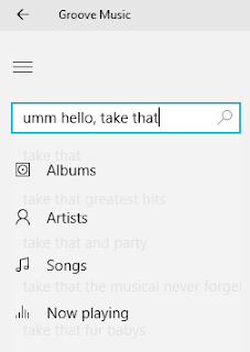
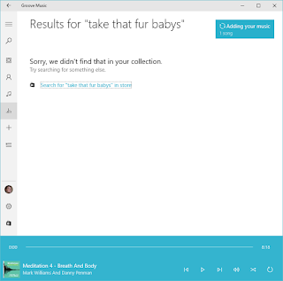
However, as said before, the longer you spend in Groove, the quicker it all just becomes a frustrating clunky experience, not least when you use the search facility, which not only annoyingly doesn't clear the last search term you enter but also brings up some unusual suggestions to artists/songs that don't even exist.


Then there's shrinking the size of the app, which makes it look pretty and compact but means you've no way to get to the menu:


Although there are a few nice touches to Groove, such as the taskbar "controller" to enable you to stop/skip tracks, overall Groove is a dumbed down version of WMP that feels as if everything is more cumbersome and chunkier than it needs to be. No longer can you move through your music as fluidly as in WMP, or even see as many tracks/albums on the screen at the same time.  Groove does it's job as a purchaser and player of music but it's really a music app you'd probably not want to spend a lot of time in.

What’s the alternative?

Windows Media Player is still there for the hard-core people but in the days of free music streamers like Spotify, even that can feel outdated and OTT for one's music needs. If you really want to there's always iTunes to play and purchase music although it's easily software that far more bloated and intrusive than Spotify or Groove combined. There are also various music apps in the store if you want to have some fun checking them out.

Hit, Miss, or Maybe?

Maybe; it does an acceptable job for purchasing and playing music but lacks any real charm and user-friendless that one would need to use it for hours without getting frustrated.


Sunday, 21 February 2016

Windows 10 System Apps Review: Get Started


Note: This page is a review which forms part of the post Windows 10 System Apps Review

What’s this app for?

Back in the “Good old days” it was impossible to log into Windows without being told how to use it. Forever playing catch-up, or just taking their time, Microsoft have an app that tells you everything you need to know to get the most out of Windows 10 and it’s called, you guessed it, “Get Started”. From customising your desktop, how to get the best out of Edge (hmm, that’ll be interesting), and how to use most of the system apps, this “Get Started” app has a lot of simplified guides and videos to help explain what the heck you’ve just installed or logged into on your computer.

Does it do the job it was primarily designed for?

Yes. There’s a wealth of information in this app; there’s 'What’s New in Windows 10', how to search and get help, setting things up, connecting to internet, how to use the start menu, Cortana, Windows Hello, Edge, Xbox App, Entertainment, Office, Personalising, Apps, Continuum and Accessibility. Pretty much everything you could think of is all there in a user-friendly form, in terms of its presentation and its concise guides.


In addition to the kudos to Microsoft for the diversity and amount of information in this app, there are also plenty of videos to show you how to use certain apps like Edge and Store. The layout of the videos is remarkably like the video player in the “Films & TV” app. I’d be surprised if it’s not leveraging that app’s abilities to do the videos. Most of the videos also have Subtitles, which is quite simply a must have feature in such an app. Thankfully the videos are quite short too, so no one is going to get bored that quickly.


Sadly, all is not perfect. The app is clearly missing a search facility, which would make finding how to use something a whole lot easier than randomly clicking through different topics and hunting away.

There’s also no obvious tie-in between Cortana and this app. If you search for help in Cortana, you are directed to a Bing Search Results page most of the time, which is usually hit and miss on giving you useful outcomes. I’d expect that the first time a user uses any apps and features of Windows 10 that this app will pop-up, which I have seen it do in some insider builds in the past, but on my testing by logging in as a new user in Windows 10, I hardly ever saw this app. Sure, it’s in the “Most Used” section of the start menu for a new user but it should be there as a large tile and/or on desktop/taskbar so people can’t miss it. Sadly, there’s nothing there automatically helping new users to understand an OS Microsoft wants us to embrace.

Lastly, none of the guides are capable of ‘one-clicking’ you to the right location in the OS to do something or at least show the user how to do it, such as if you’ve read about Edge but are still unsure where it is. Be nice if the app could show you where Edge is. Alas, nothing like that, which would have been useful, but I guess they want users to figure things out and learn from the experience. Microsoft have obviously never worked with users of varying levels of expertise …

What’s the alternative?

Phone a friend? That’s probably what most would do, but providing you know how to fire up a browser and type, you can go to http://windows.microsoft.com/en-gb/windows/support#1TC=windows-10 and see most, if not all, of the same material that’s in this app online.

Hit, Miss, or Maybe?

Hit; I’ll give this the thumbs up. Sure, it could be more interactive across the OS and relies too much on the user knowing the app exists, but when you open it up there’s no doubting that there’s a lot of good entry level and user-friendly information about Windows 10 in the app.